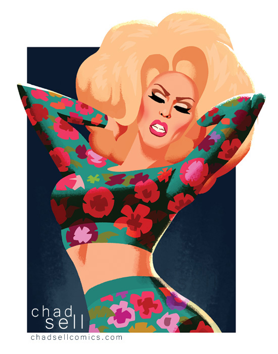
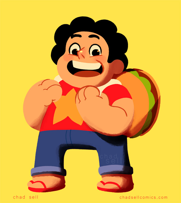
RPDR8, Episode 4
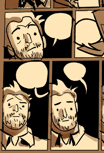
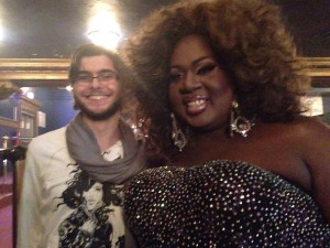
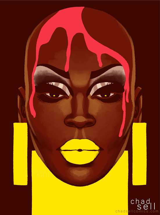
Kat Sass joins me this week to discuss Episode 4 of the Drag Race! Kat is an amazing singer and performer in Chicago, so I was excited to hear her thoughts on the New Wave challenge! (Photo by Sam Probst)
Chad: This week's episode was a breath of fresh air for me -- I loved the challenge, I loved the workroom dynamics. What did you think of it all, Kat?
Kat: I loved that they were able to write their own lyrics and come up with their own looks. I thought the New York team came across as bullies, but I'm pretty sure they were all picking at each other during the work room time, and the New York team got a rougher edit. It's a lot like when we all get ready for a show together, we pick on each other one second, and lend each other nail glue and shoes the next.
Chad: I 100% agree with you that it was SO GREAT to see the queens picking their own teams, writing their own lyrics, coming up with their own goofy acts. The NYC team had especially funny choreography and timing.

Chad: The workroom shenanigans with Thorgy were absolutely priceless. I love that the quirky qualities that make her such a joy to watch also make her difficult to work with.
Kat: Thorgy reminds me of my dad. A consummate, classically trained artist, approaching things from a really specific viewpoint. Highly trained classical musicians tend to approach work in a way that is less overtly aesthetic and more about the rhythms of the words, the way it feels... it's why her comic timing is so dead on, I think.
Chad: Oh, that's fascinating!
Kat: She can feel the rhythm of it and find the space where the beats of a joke belong. She's also terribly silly and easily distracted like my dad.
Chad: HA! Would you also consider yourself a classically trained musician?
Kat: Hmm, not really. I am, in fact, a classically trained performer -- I was raised on Chekov and Shakespeare and the like. My parents are both artists, and I was, like, basically fed art and music from the second I popped into the world. So when I told them I wanted to be a lawyer when I was 8, they were super confused.
Chad: You're a trained singer, though, surely?
Kat: I am trained, but my voice still needs refinement and work, things I can hear, you know? Some people's voices are instruments – they are pitch perfect, the tone is great, and so on -- mine comes from my guts, my feeling.
Chad: I see, well I remember being struck by your skills when I first saw you in Snow White and the Seven Drag Queens! I was eager to hear what you thought about the singing and performances this week -- but first, I was curious about your opinion of Lucian's vocal coaching!
Kat: I think that Lucian seemed... too vague in his direction to help them change their tactics and be more successful. I didn't love that he told the NY crew to be "less musical theater" when they seemed to really just all be parodying the genres, anyways.
Chad: Yeah, Bob wasn't the only one who was confused by that. I thought their campy approach totally fit both the song and the challenge!
Kat: Lucian suggesting Lorde literally made zero sense to me. I came away from it not sure how many of them could actually sing, what about you?
Chad: Ha! Well, despite a bit of acting in high school and college, I have a TERRIBLE ear for singing. I felt like both the Streetmeatz and Les Chicken Wings delivered fun, punchy performances, but anytime they sang in unison, I didn't really hear any effective harmonizing. Most of them stuck with the "speak singing" which more or less worked for me!
Kat: The speak singing was....probably for the best.
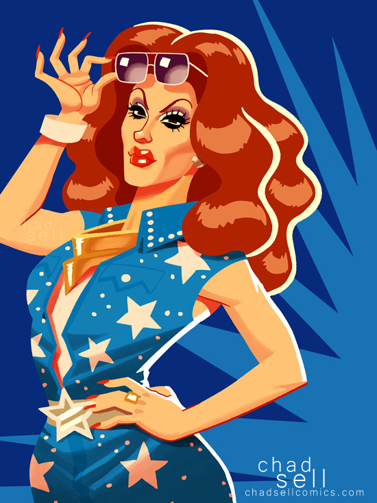
Chad: What about Derrick -- Debbie Harry claimed she sang well, but Lucian cautioned her not to.
Kat: I don't think she was good. Perhaps she was the best of the day – or at least the only one harmonizing. But I'll be damned if I'm gonna argue with Debbie Harry. She's obviously a witch –
Neither her face nor her rack has aged in 30 years.
Chad: HA! She wields VERY powerful magic.
Kat: I can't decide if I want to fuck her or be her. Aren't those the best people?
Chad: Yes, the best.I feel like there must be a very steep learning curve to overcome in singing live for an audience -- the mic, the nerves. How did you think the queens did at the basic task of.... being heard and putting on a show?
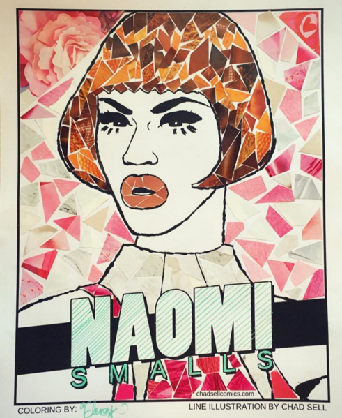
Kat: I was overall really really pleased with that part. Hell, I still get nerves. These queens are extremely tough to manage the task for TV, especially if some of them are not comfortable singing. I personally was super-loving Kim and Naomi for their enthusiasm and embodiment of their characters.
Chad: Ha! Yes, even if Kim isn't necessarily someone I think of as "punk," her sheer enthusiasm and spirit absolutely sold it.
Kat: Punk would be literally THE LAST TERM I would use to describe Kim, but she slayed. I have never met someone so overtly and profoundly glamorous who also totally is a sweet, humble goofball.
Chad: Do you think Robbie deserved the win this week?
Kat: Robbie led the team well and made sure everyone was able to provide input. I think she is a fucking great stage performer... I just hate the edit they are giving her.
Chad: I found Chi Chi to be an extremely compelling and complicated character this week -- on one hand, her teammates found her difficult to work with, but on the other, we learned more about the challenges she's struggling with at home. What were your impressions of Chi Chi?
Kat: Scrappy, hungry, talented. She has a long way to go to develop into the type of pro they are looking for, but she is incredibly smart and fast on the uptake. I admire that she has gotten to where she has, and she could potentially be a dark horse for the season. I would be surprised if she is a difficult team member again. She seems to want it bad enough to change habits quickly!
Chad: I hope so! It seemed like some of her detachment was due to insecurity about her wardrobe. At the start of each season, we see the queens show up in the workroom as if by magic. And each week, they whip out some fabulous runway look, often with little explanation of where it came from, who made it, and how much it cost them. It's been really interesting to see things from Chi Chi's perspective, where she's working with such limited resources and finds herself trying to compete with queens who have likely spent thousands of dollars on their looks!
Kat: I definitely agree that the detachment was from that very insecurity. And yes.... we all end up spending a lot to do drag. I feel like if you love it and want it enough, you will fashion anything you can to make a look happen. I myself have used crazy things to build a look out of.

Chad: I find myself wishing we had more of a look at the queens' lives at home -- I wish RPDR did something like Project Runway, where Ru would travel around to see each of the finalists at home, see their drag closets, and kiki with their families! As brief as those glimpses are, it can be so insightful to see where the contestants have come from.
Kat: Thats a terrific idea! I dislike not having enough background knowledge of the queens to understand their motivation, and that's a terrific (and possibly very juicy) solution.
Chad: I just doubt Logo has that kind of travel budget!
Kat: HA! Agreed.
Chad: Although the runway section of the episode went by at lightning speed, I loved the neon concept! Who were your standouts?
Kat: Kim, Betty, Naysha were my standouts. You?
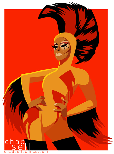
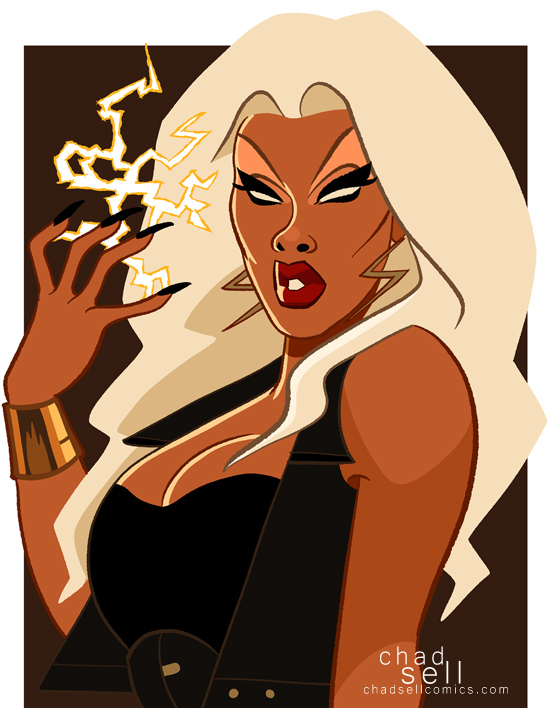
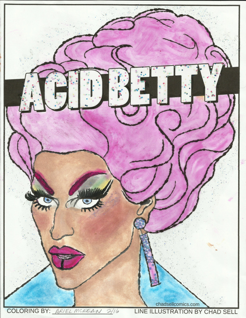
Chad: I had definitely been waiting for this look from Acid, ever since getting a peek in the season's trailer!

Kat: those GILLS THOUGH.
Chad: Are you pro or anti-gill?
Kat: SO MUCH PRO
Chad: I don't always love everything about Acid's looks, but I think this one was kind of perfect.
Kat: It was a gorgeous makeup.
Chad: The subtle scales painted on, that incredible wig.... It was sublime.
Kat: I couldn't stop looking at it. Every angle was enticing.
Chad: I really, really, really hope we see more looks like this from her. When she does more conventional drag make up, I just don't find it quite as compelling. But when she goes all out like this, it's genius.
Kat: I think she is more of a creature than a woman, and I live for that.
Chad: Exactly!
Kat: Drag shouldn't always be about gender, anyways.
Chad: Right! Speaking of drag and gender and breaking the mold, do you ever expect bioqueens to be on the Drag Race? (Is “bioqueens” the right term? “Faux queens?”)
Kat: I just say drag queen – but Bioqueen is the term I use when calling myself a drag queen makes people squirm. And, I hope we make it onto Drag Race. I think I have a shot someday if I keep busting my ass and growing as an artist, and my feet and ankles don't go! Drag is excruciating on the body... people don't realize that.
Chad: Are high heels what make it so excruciating? Or are they just one component -- corsets, wigs, makeup, etc?
Kat: Oh, well the back bruises from corsetry and the knee and ankle injuries and torn fingernails and so on... But as you go, you find solutions to allow yourself to do it quickly and often. And not get hurt. IT'S A TOUGH SPORT I TELL YOU
Chad: You're a WARRIOR, I have no doubt!
Kat: I don't even have to tuck my dick. Imagine what other queens go through!
Chad: I generally try not to!

Thanks so much to Kat Sass for joining me this week! You can follow her on Instagram, Facebook, and Twitter!Some of Kat's upcoming Chicago gigs include Trannika's Most Wanted on April 6th at Berlin and Michelle L'Amour's Spectacle at Untitled at 10 pm on April 7th.
Kat is also co-producing a new Bioqueen show that premiered with a sold out show at Second City! Follow her on social media for future dates and cast announcements. And if you would like to be considered for booking, please e-mail her: ihatekatsass@gmail.com
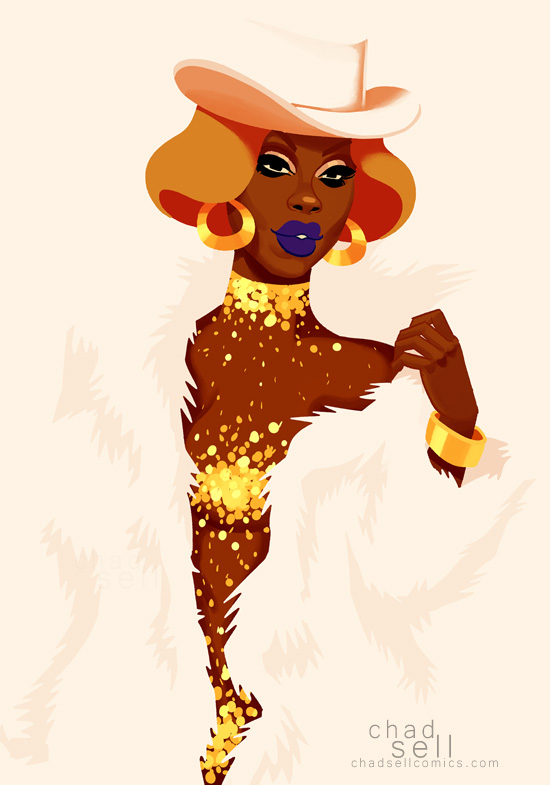
(Photo of Kat by Shann Treadwell. Gown designed by Michael Buounincontro.)
As always, you can find my latest prints on Etsy, and support me on Patreon!
If you will be in Seattle next week, find me at Emerald City Comic Con!I'll be at Artist Alley table F-01!


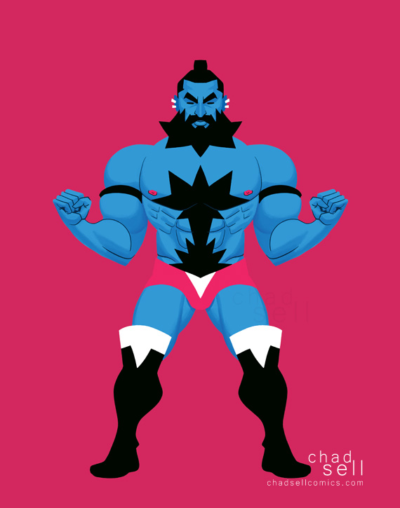
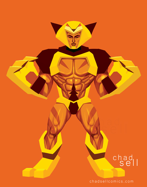
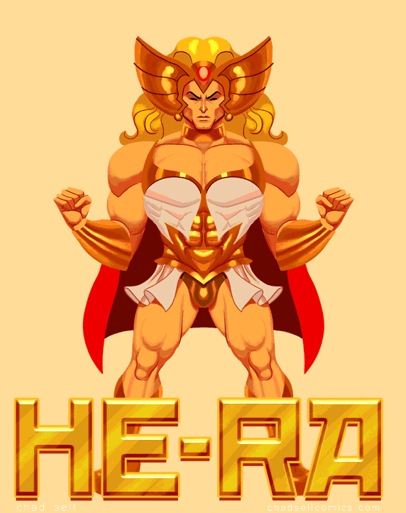
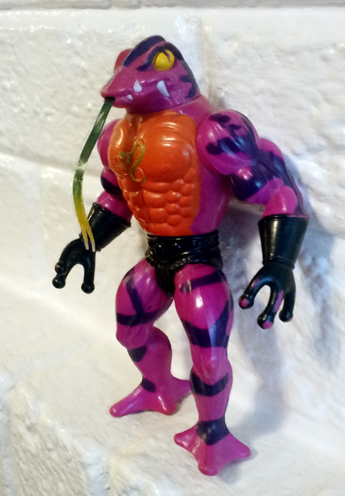 I had a major revelation on Thanksgiving. While rooting through an old closet at my parents' house, I dug up my old HE-MAN toys. And I realized, "Wow, these are everything."
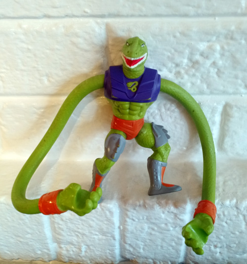
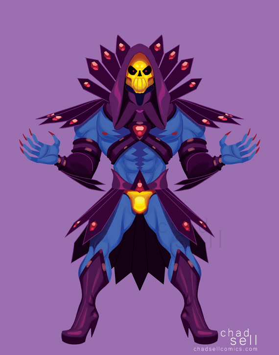
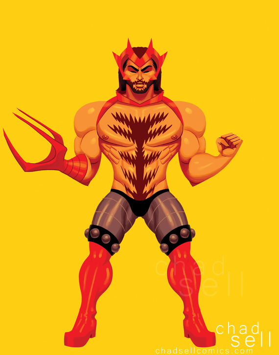
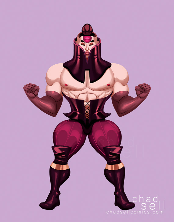
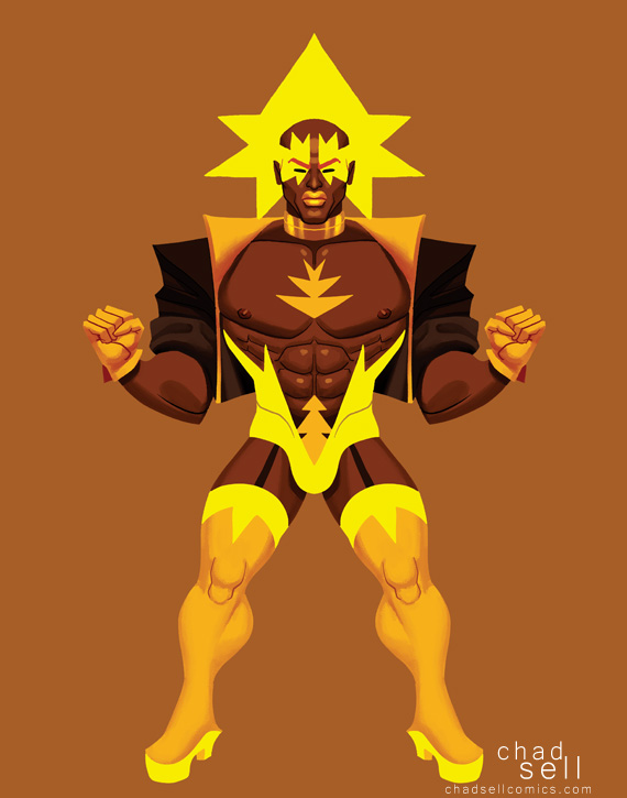 BOLTT, one of my favorites.
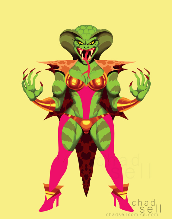

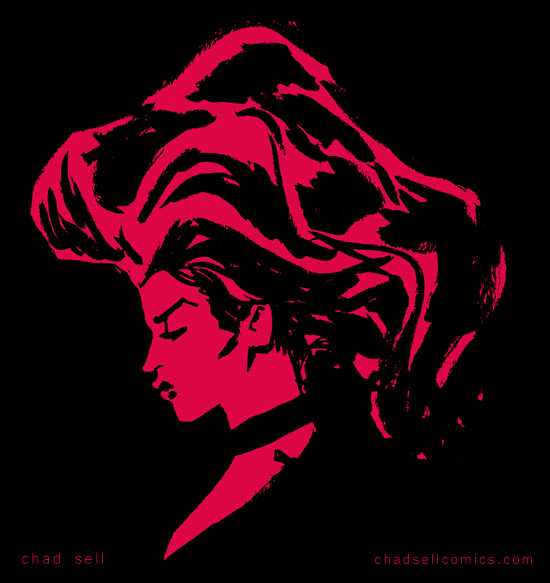
 One of my very favorite artists working in superhero comics today is
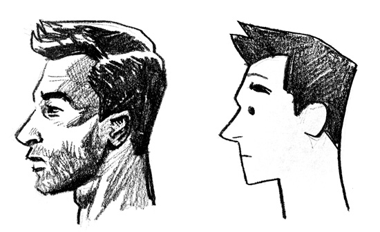
  Stop worrying about what looks "real" and concern yourself with what works.
 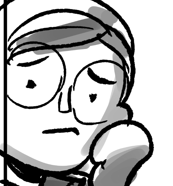 If you're not working digitally, take frequent breaks to step back from your desk and see how it looks from afar.
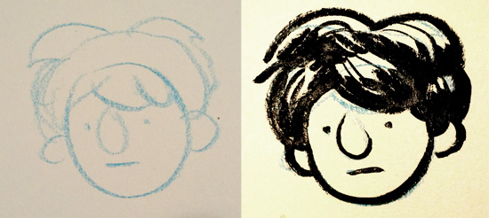
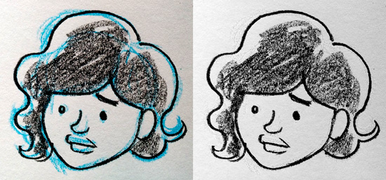
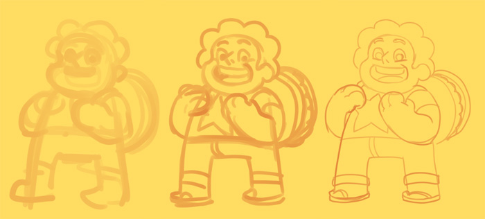
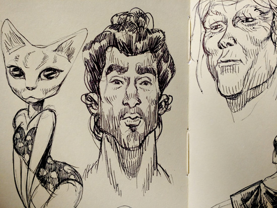 In the spirit of loosening yourself up, sometimes keeping things tiny will help, too. I really enjoy sketching in my tiny Moleskine book, because the little pages will keep you from getting too precious or detailed with your work. I find myself using a simple Bic pen in my Moleskine, because I can get incredibly delicate lines that work perfectly at that small size.
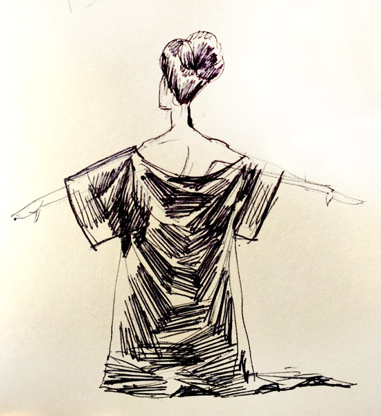
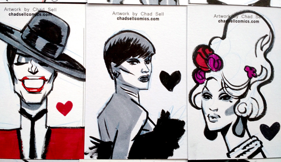
 I really look forward to my monthly postcard sketches for my
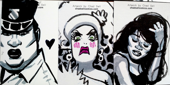

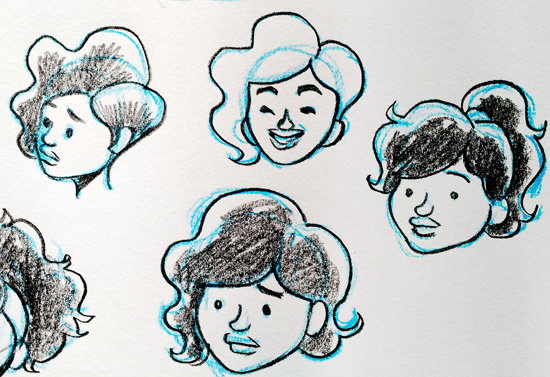
 All this month, I've been busy drawing the “
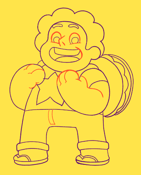
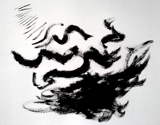
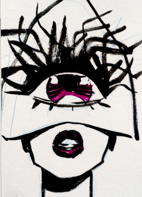
 You'll also notice that the line is fairly rough. I use my own variation on a