PATREON TUTORIAL #3 (For Patreon supporters only!)
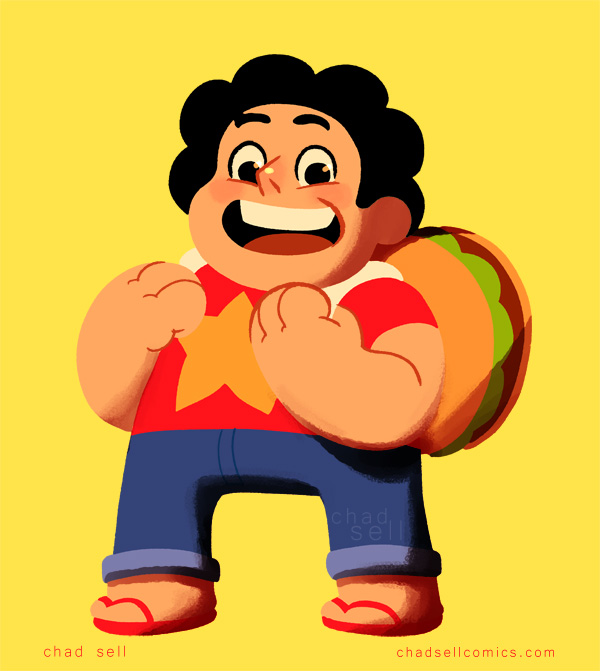 All this month, I've been busy drawing the “doodle drafts” for my Cardboard Kingdom comics, so I don't have much new art to share with you that wouldn't spoil the fun! However, I recently started watching Steven Universe (thanks to a new Hulu+ subscription) and I'm totally loving it! I had heard the rave reviews, and I had caught a random episode here and there, but it's been great to start at the beginning. Additionally, I LOVE the clean, colorful art style. The fun character designs are totally in line with what I imagine for The Cardboard Kingdom, so I decided to draw Steven and share some peeks at my process!
This method is how I create pretty much all of my color art – from Drag Race stuff, to superheroes, to everything else. The vast majority of the work is done in Manga Studio EX 5, but we'll take a brief sojourn into Adobe Photoshop.
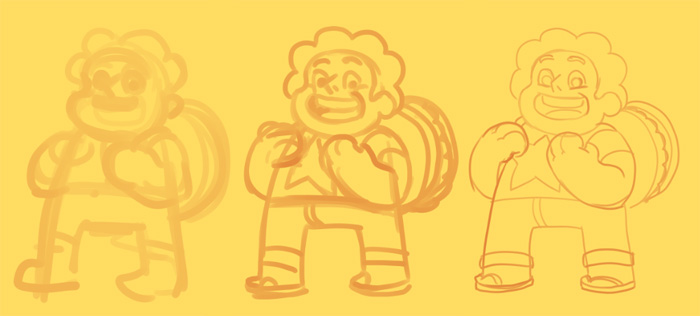
As with anything, I start with a big, thick pencil tool to work out the main shapes of the figure. On a few different layers, I'll add tighter lines as I develop the drawing.
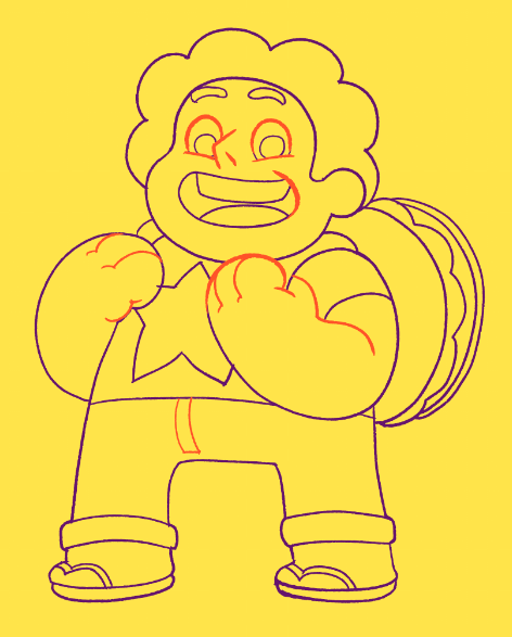
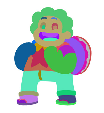
Now here's where things get a little tricky. It's my system for drawing final linework and establishing the colors at the same time. First, you might notice that I used two different colors at this stage. The purple is on a separate layer, and it's meant only to delineate the shapes of flat color. In other words, all those lines will disappear in the final art. The orange lines, however, are specifically the ones intended to stay through the end!
 You'll also notice that the line is fairly rough. I use my own variation on a Frenden brush to give that organic feel to my linework. My worry about doing art digitally is that the lines can get too crisp and lifeless, so it's my method of adding a little bit of texture to my work.
Once this stage is complete, I export the whole page as a PSD file and open it in Photoshop. I use a plug-in called BPELT to take that line drawing and turn it into flat shapes of random color! It looks crazy, but once we bring it back into Manga Studio, it will be easy to use the fill tool to incorporate all the actual colors of our dear Steven. (Just a note: the actual steps of using BPELT are a little complicated and technical. Be sure to follow its directions for the best results.)
Back in Manga Studio, I import the PSD and place it under that orange line layer. Fill in the colors however you like, and add different colors to the line layer, too!
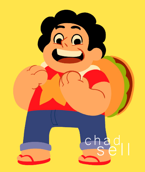
At this stage, I was pretty happy with how Steven looked. In the actual cartoon, there's only minimal shading, but I wanted to add some highlights and deep shadows to give him a little more depth.
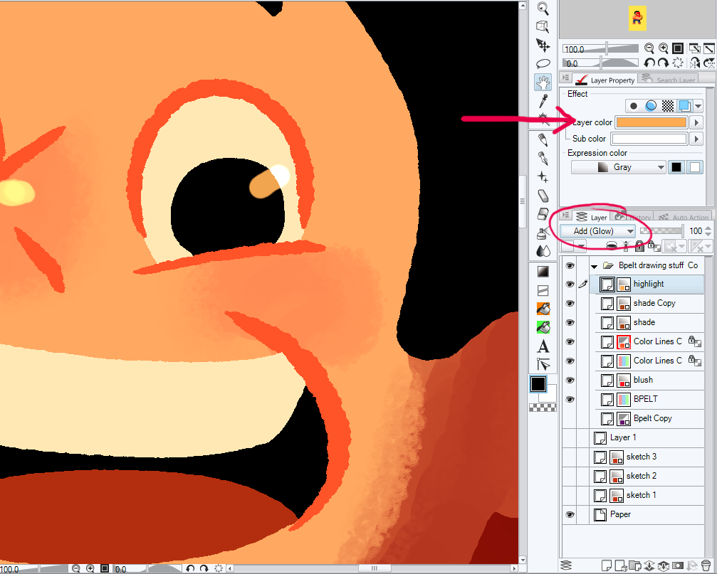
I made a separate “highlights” layer that uses the “Add (Glow)” combine mode, so that it lightens the layers beneath it. One of my favorite aspects of Manga Studio is that you can specify the color of specific layers. That means that whenever I draw on a layer, it will be in that particular hue. For highlights, I like to use a yellow ocher that gives a nice golden look to everything.
I add the shadows in a similar way, but I make the layer a darker brown and set it to a “linear burn” combination setting. I use a rough blending tool to soften some edges of the shadows, but I don't like to overdo it!

You might notice the clean, sharp edges of the colors and shading. How do I get that? Well, because the original flattened colors are still their own layer, I can use the wand tool to select whatever area I'm working on and restrict my shading and highlights to that specific area. Alternatively, I can clean up any shading that spills over an edge by selecting the area outside it and simply deleting that part of the shade layer!
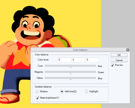
It can be a real challenge to decide when a piece is “done,” to determine when there's enough detail and enough contrast. But since Steven's aesthetic is so bold and simple, I wanted to have a similar look with this piece. I made the final adjustments of his color palette using the color balance and saturation tools, and then it was done!
If you have any questions, ask them in the comments section, on Twitter, or Facebook!